“Remember that it is the general structure and movement of the tree that is important to your painting, not every twig.” – Joanna Carrington, Landscape Painting for Beginners, 1971
With the warm weather and long days, it seems only right to be outdoors with my paint palette. Escaping to the shade, away from the aggressive sun and heat, I can make watercolor studies of trees that I just couldn’t accomplish otherwise. And I really think that the speed which these dry outdoors, with the sunlight and warm breeze, give them a different quality somehow than those that dry slowly indoors.


^ Storm Clouds Over Landscape with Trees. 2013. watercolor. 6×9″. © Bullock Online 2013

^ Sketchbook page showing storm clouds over a landscape. 08.2012. © Bullock Online 2013
“Every genuine effort in Art is complete. It is the expression of an emotion, and being such is finished.”
– Alfred W. Rich, Water-Colour Painting (ch. v), 1918
Continuing to work with a limited, 5-color palette, I am working from past sketches and notes. I have a real fascination with the idea of working representationally from notes and color sketches, and have been trying to get better at figuring it out and creating convincing effects. The attempt is to recreate something which was seen and experienced, and which is now a memory, and to do so faithfully and accurately. Yet painting is, in fact, an interpretation of that memory — conscious decisions from the start require limiting and abbreviating the thing depicted, or at least bringing it in line with the materials at hand, ironically resulting in, possibly, a more accurate depiction by deleting everything unnecessary and leaving only the important elements remaining. And this is not an argument for total reduction. Far from it. But the history of painting is of exactly these kinds of decisions, I think, and paintings succeed or fail based on these decisions. No less so in the case of landscape painting.

 [^ Still-life with Bowls and Citrus. charcoal. 10×14″. © Bullock Online 2013]
“Unity is necessary because without it our minds and eyes are worried by disorganized muddle. Some shape and pattern has to be imposed; things have to ‘hang together’. On the other hand without variety, our second need, our eyes quickly become bored and lose interest.”
– Bernard Dunstan, Composing Your Paintings (1971)
Still-lifes offer the great advantage of being able to compose a painting and work on it at one’s leisure under what is pretty much a perfectly controlled situation. The objects, the lighting, everything. Fruit and flowers wilt but can be replaced. Overall, it is pretty ideal.
Composition skills are especially important in still-life subjects, in my opinion. I went about composing this with two aims — to disrupt all these round shapes while keeping visual balance. Ellipses are something I am still struggling with a bit, evidently.
But it is fun and productive to grab a few things from around the apartment, and to put something together, and to get some pencils or brushes to see what comes of it.
Just have to get better at those ellipses.
Visit Bullock Online: paintings and works on paper by Robert Edward Bullock.

[^ Study of Brooklyn Rooftops #04072013. oil on panel. 5 x 7″. © Bullock Online 2013]
“When the field of vision is confused or the material too close, the zoom principle will be useful — either a card with a cut-out viewing space, or simply the concentration of sight on to one small area to the deliberate exclusion of everything else.”
– John O’Connor, Landscape Drawing and Painting (1978), ch. 3: Selection of Image
I love walking around the boroughs and looking at the rooftops with their haphazard arrangements of walls, ledges, cooling units, skylights, water towers, and window panes. Any monotony that occurs at street-level seems to resolve itself up there. Almost always something interesting is composed against the sky.
I carry a medium-gray, adjustable view-finder with me to help block in the subject (and block out everything else). I might look a little weird squinting through this with my head tilted back, and sometimes people slow down and look up to see what has my attention. The view finder visually isolates the subject, framing it so that the shapes and proportions of its elements become clear. It is a “5” on the gray scale ranging from “1” to “10”, which is very helpful in determining the tones of colors. Whether one is doing a sketch or a painting, mastering tones is important, and something which I still struggle with. You can buy the View Catcher here.
This small oil painting, a study really, is from notes in my sketchbook from November 2011. Working from notes is a very different process than painting outdoors and, as such, I achieved a different sense than I would have with the plein air approach. I think it has a more calibrated, cubist sense to it, a geometry that I wanted to hold onto as it became more clear. I deleted all minor details like satellite dishes and wires so I could focus on the composition and tonal arrangements.
Annoyingly, my camera has created a slight “curve” effect to the left and right margins.
(Somehow, I had overlooked doing a post for March. This may be the first time in the five-or-so years I have been doing this blog that I forgot to do a monthly post.)
Visit Bullock Online: paintings and works on paper by Robert Edward Bullock.

[^ Lime with Pink Bottle. oil on panel. 5×7″. February 2013. © Bullock Online 2013]
These small oil sketches really help me to work through ideas, compositions, shapes, and to gauge colors and values. I have not translated any of them up into larger ‘finished’ works yet because of space limitations, but just working through these small pieces and having a result in one or two sittings is really helpful.
In this I wanted to sort of sidestep a complimentary color relationship, and aimed more for a pink than a red, placed opposite a bright, banging green. Accurately rendering the shape of the lime was important because I did not want it to be identifiable only by its color.
Visit Bullock Online: paintings and works on paper by Robert Edward Bullock.
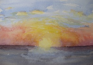
[When Day and Evening Meet – 12.22.12. 2012. plain air watercolor. 7 x 10″. © Bullock Online 2013]
“Hesperus! the evening mild
Falls round us soft and sweet,
‘Tis like the breathings of a child
When day and evening meet.”
– John Clare (1793-1864)
These short, cold, gray woolen days often end in an explosion of light and color which seem almost absurdly cliché and unreal, like a massive Lite Brite on full power. They are really amazing. With an unimpeded view of where the Hudson meets the East River, I get the full effect and aim only to accurately set down the scene before me, at least for the purposes of this — plein air painting, which is exactly what it sounds like: direct, truthful, unadorned observation and a simple, straightforward representation of the outdoors and the effect of natural light. Yet, afterward, I often look at what I painted and say “this is too much”.
Visit Bullock Online: paintings and works on paper by Robert Edward Bullock.
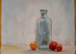
(^ Pale Blue Bottle with Heirloom Tomatoes. 2012. oil on panel. 5 x 7″. © Bullock Online 2012)
“Organizing is what you do before you do something, so that when you do it, it is not all mixed up.”
– A. A. Milne
“One of the advantages of being disorderly is that one is constantly making exciting discoveries.”
– A. A. Milne (again)
I admit it — I find painting terribly difficult work sometimes. And if I am painting in oils, then doubly so. On the one hand, staying organized and neat prevents it all from becoming a mess. But painting is also about letting things happen, on their own to some extent, and allowing for unexpected discoveries.
Working small (this panel is only 5 x 7″) and aiming to complete it in one sitting means I have narrowed my range of colors to only six (not counting white and black). I can mix clean, bright secondary colors (orange, purple, and green) and some rather pretty muddy kinds of colors, some of which are unexpected and which I get when things start to go awry. We painters love those.
But it is not fun, I don’t think. It is hard work. And often frustrating. Yet something makes us painters do it anyway.
Visit Bullock Online: paintings and works on paper by Robert Edward Bullock.


